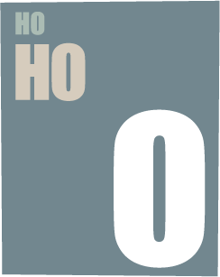
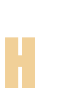
The most common optical illusion we experience pretty much daily is one you’ve just run across reading this sentence. There is a trick type designers use to make all the letter forms in text look the same height even though they’re not. Letters with rounded tops and/or bottoms are actually bigger than squared off ones. Letters like C, O, and U are taller than E, H, or N. If they were the same height they wouldn’t look it. That’s because… well, look at this:

These four shapes are the same height from top to bottom. The lack of mass at the tips of the rounded shapes fool our eyes and so they look shorter. Even the color makes a difference, lighter colors advance, so they say. The white objects look slightly taller than the black ones, even though they’re not. Ever hear of the French term, trompe l'oeil, “fools the eye”? That French spelling sure fools the heck out of me. Never mind, that’s about something else. Anyway, check out this sample of Impact type:
Mouseover to compare type heights
Each line of type is a consistent point size. Also, the kerning (relative space between letters) is tighter the bigger the size so it looks “colors up” right, as they say. Of course if you’re like me and use goofy type styles like Ad Lib and such this isn’t much of a concern, the letters are intended to look cockeyed.
Here’s another common illusion. What color is the box below?
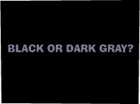
Do you think it’s black? It isn’t. Hold a piece of black paper up next to the box and compare. That black square on the screen is not so black after all, is it? The darkest your screen can ever be is when it’s off. Adding energy or light to it can’t make it a whit darker. (How much a whit is I couldn’t say. Maybe a tad more than a skunch.) This is because of a thing called color constancy. At least I think so. Look it up and get back to me.
Below are more examples of something along those lines. On the top two, the inner boxes are the same size and color. Below that, the lines are same length and color.
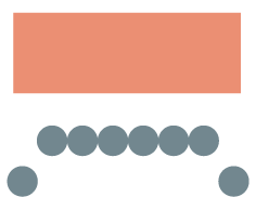

Mouseover to confirm
I admit you don’t run across this every day so I guess I shouldn’t have brought it up. At any rate, all this pretty much means colors appear different depending on what they’re next to in your field of vision. That’s why the paint in the can looks great until you put it on a wall where it looks like crap. Same thing.
Here’s something a little more common. Which picture is more “realistic”?
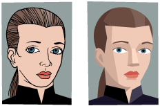
You might be tempted to think the first is more “realistic,” but it isn’t. Look at yourself in the mirror, if a mirror isn’t at hand, look at someone else. Is there an outline around the head? Do you see a black line defining the nose or mouth? Of course not. Line drawings are a convention to represent shapes. The real world doesn’t look like that, it’s all colors and shapes and shadows, like the second picture. The first picture may be a more recognizable representation of a person than the second, but it isn’t more “realistic.”
I’ll bet you thought I was going to write about the necker cube, that poiuyt* gizmo, or how objects in the mirror are closer than they appear, didn’t you? More than the eye can be fooled on a daily basis.
On the following page are some more optical illusions. If you are not optically illused, better have your eyes checked.
*A poiuyt is what you see in the opening illustration above. The name comes from the keyboard, like qwerty only starting at the other end running right to left.
© Terry Colon, 2006